
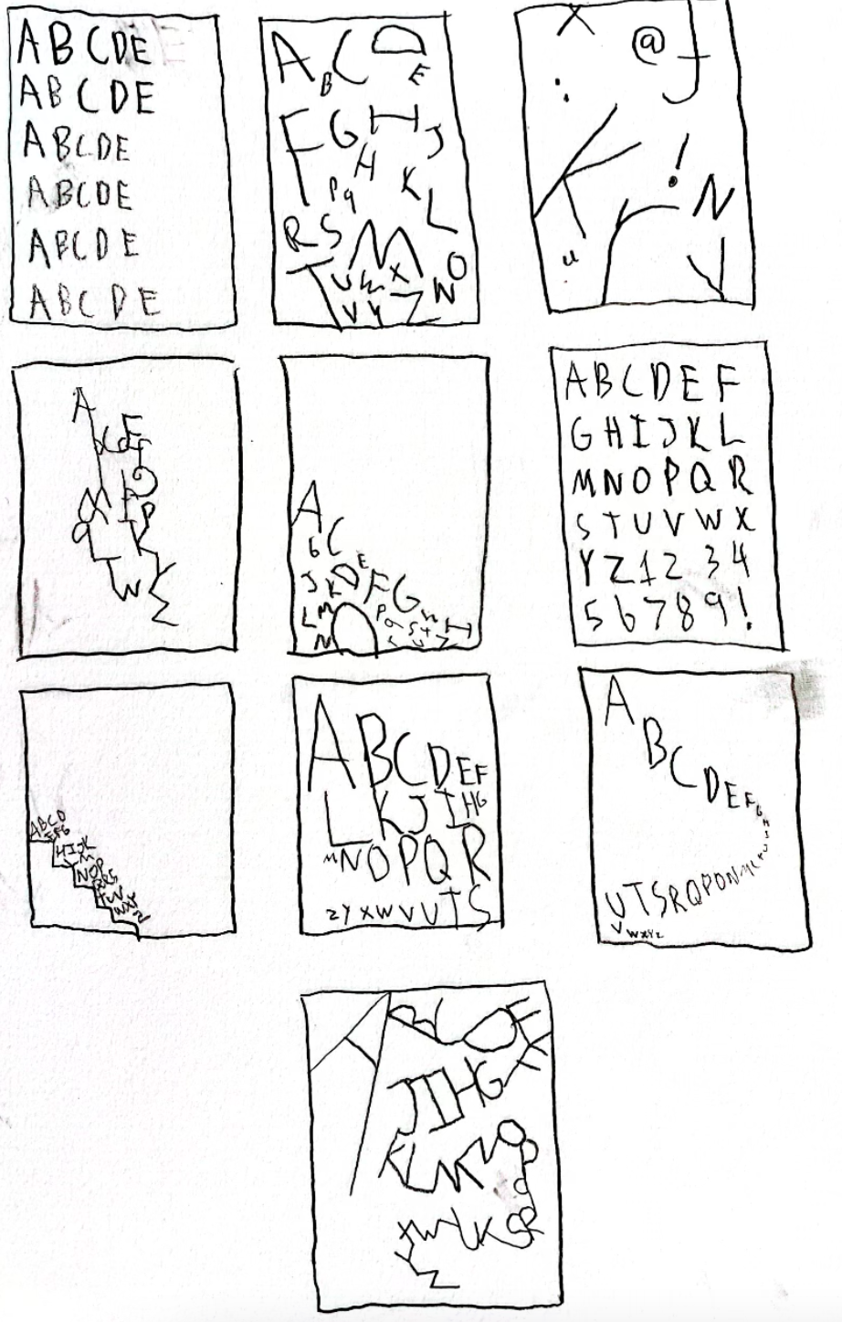
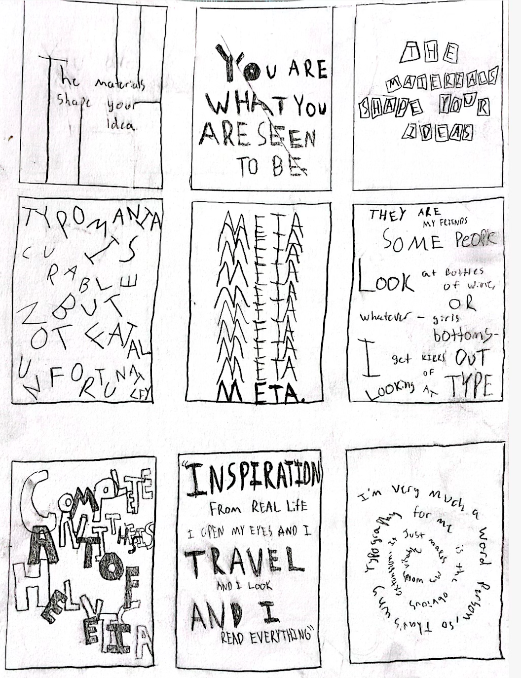
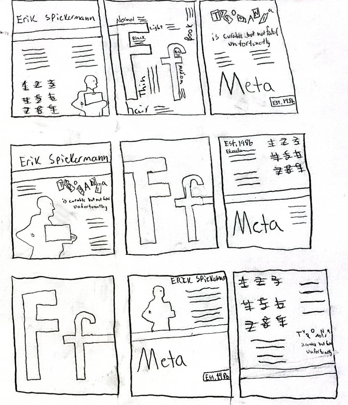
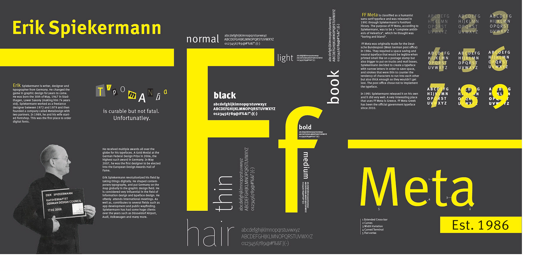
The purpose of this project was to create a triptych poster on a famous typographer and their most well known font. The focus of my project is based on Erik Spiekermann and his font ff meta. The poster contains extensive research on the typographers life as well as his font. The purpose of this poster is to establish three posters that work together in one composition as well as on their own. The triptych series involved studies that such as type as image, the typographer's font/text, an alphabet showcase, a designed quote, detail study, and a specimen study.
Font

Color Palette
Sketches
Final Pdf's
Final Applications
Photo credit: https://us.gestalten.com/blogs/journal/catching-up-with-erik-spiekermann